Silverback have been an invaluable partner in shaping Coastland’s next chapter. Their professionalism, creativity, and deep understanding of our vision meant the process was seamless from start to finish. What stood out most was their ability to translate our ideas into something tangible and impactful, while always keeping our values at the heart of the work. The outcome has positioned us strongly for the future, and I’m grateful for the dedication and expertise Silverback brought to every stage of the journey.
Kate Wills
Principal & CEO, Coastland College

Discover
Weymouth College and Kingston Maurward College, two respected institutions with proud histories in Dorset, came together under a merger to form WKMC. With campuses in Weymouth and Dorchester, WKMC combined strengths in both further education and land-based training, creating a unique educational offer rooted in place and community.
As the organisation looked ahead with a new leadership team and a bold vision, it recognised the need for a refreshed identity that could unite its diverse heritage, reflect its broad educational scope, and position it for a confident future.
Silverback® worked closely with stakeholders to create a clear vision, mission and set of values that would guide the new organisation. We also developed the name Coastland, alongside a compelling brand narrative designed to communicate the organisation’s purpose with clarity and inspiration.
The ambition was clear: reposition WKMC as Coastland, a modern, vibrant and outward-looking entity that could act as both a community anchor and a springboard for growth. To inform the rebrand, we carried out extensive engagement with students, staff, governors, local councils, businesses and community representatives. This process highlighted the need for a brand that was constant, flexible and inclusive, while celebrating its dual heritage in coastal education and land-based expertise.
Design
The chosen creative concept was built around the idea of Coastland as a constant. This meant crafting an identity that could feel deeply rooted in Dorset’s natural environment while also being adaptable enough to represent a wide range of ventures.
The visual identity drew inspiration not only from the coastline, fluid and enduring, but also from the land-based traditions of Kingston Maurward, which represent growth, cultivation and sustainability. Together these elements ground the brand in the environment that shapes both the community and its future.
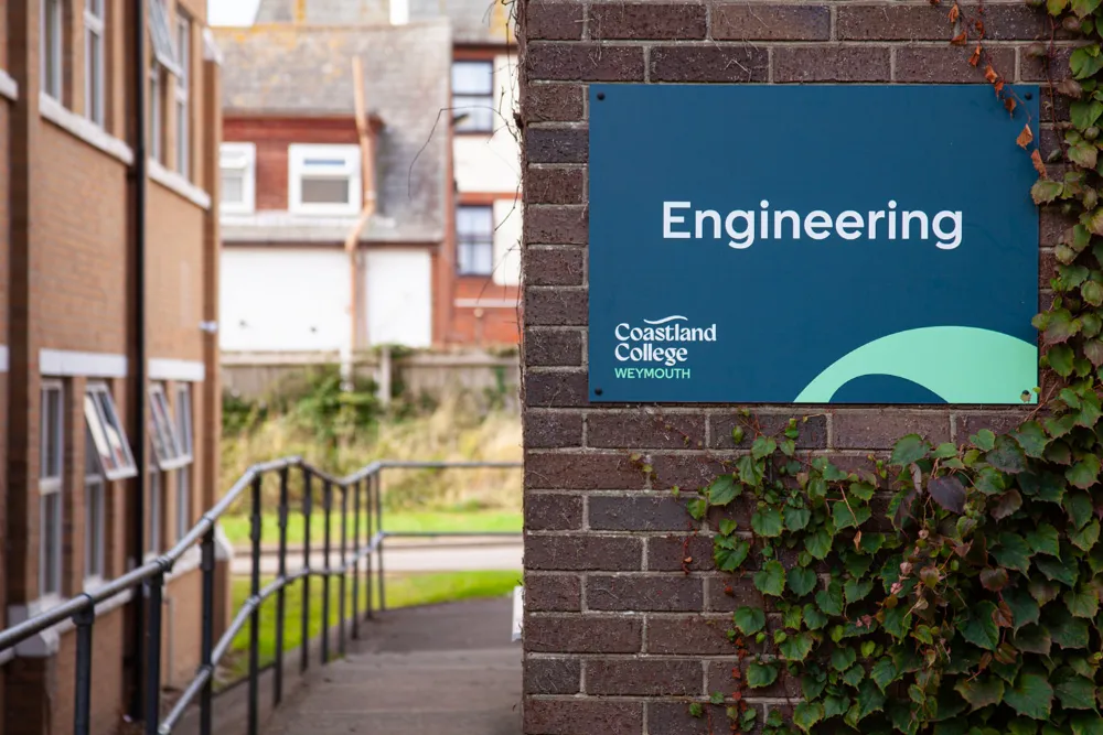
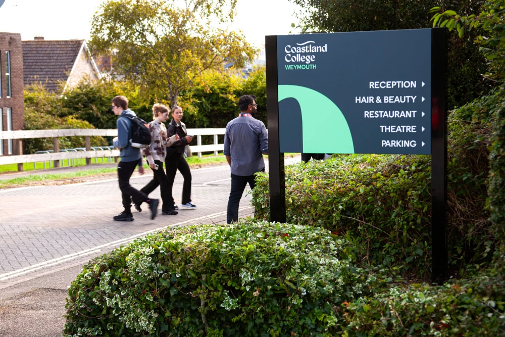
At the heart of the design sits the Ridgewave, a distinctive graphic device inspired by the forms of the Jurassic Coast and the ancient Ridgeway. The Ridgeway, which links Kingston Maurward and Weymouth, embodies connection, and the Ridgewave carries that same spirit, uniting campuses, people and ideas within a single identity. Its flowing rhythm symbolises continuity, movement and energy, reflecting Coastland’s mission to grow and adapt while remaining rooted in its heritage.
A bold, modern wordmark anchors the brand, supported by a palette that balances trust and energy. Patterns and graphic devices were designed with modular flexibility, allowing them to be repurposed across multiple touchpoints and sub-brands. This ensures that while Coastland always feels present, each commercial strand can carve its own distinctive identity within the wider framework.
Kate Wills
Principal & CEO
.webp)
Develop
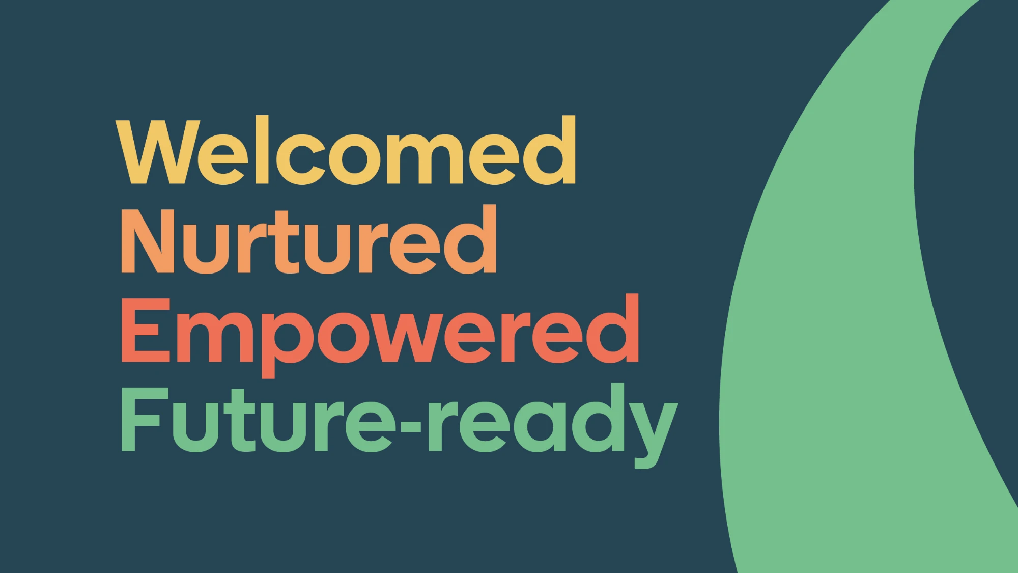
The development of the brand system focused on creating a flexible toolkit that could scale across multiple applications. A colour system was designed to mirror the student and community journey: beginning with warm, welcoming tones, moving through brighter colours representing growth and discovery, and culminating in a confident future-ready green. This progression not only symbolises the pathways Coastland enables, but also embeds the organisation’s values within its visual language.
The brand has also been designed to flex across Coastland’s commercial entities as well as its educational offer. This creates a cohesive identity system that maintains consistency, supports future growth, and allows each venture to express its own distinct character while remaining unmistakably part of Coastland.
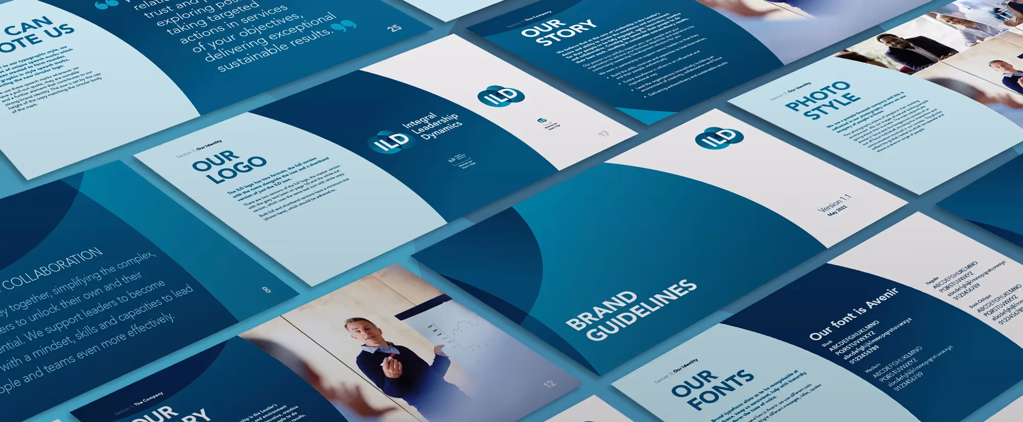
From this foundation, we built comprehensive guidelines and resources to support consistent rollout. These included detailed specifications for logo usage, tone of voice, colour application, and supporting patterns, ensuring that Coastland’s brand story could be expressed clearly and confidently across all channels.
.webp)
.webp)
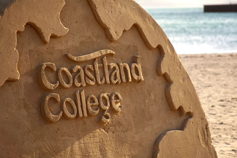
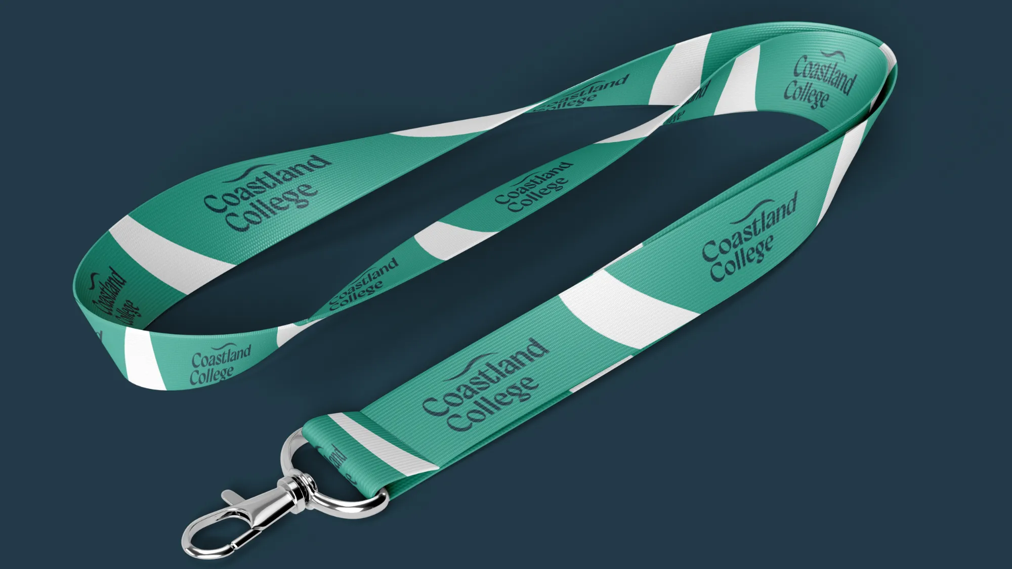
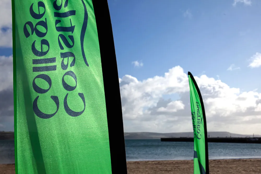
Deliver
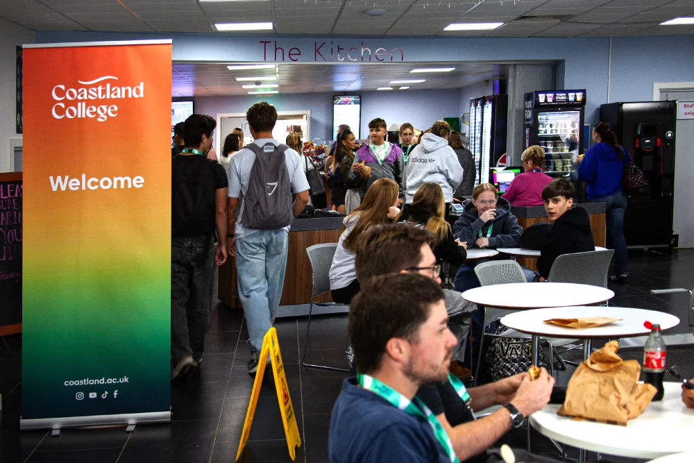
Together, we’ve rolled out the identity across a wide range of touchpoints including:
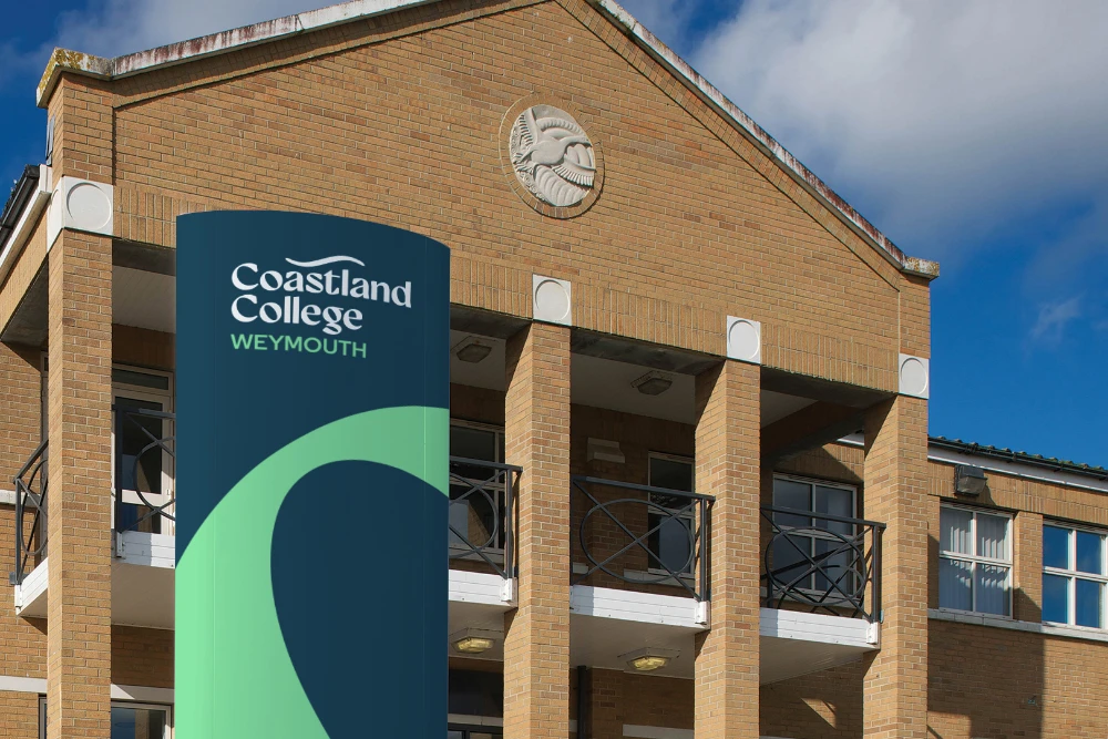
- Signage & Wayfinding
- Vehicle Livery
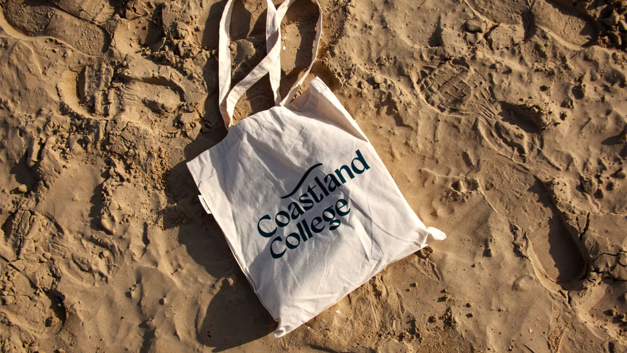
- Lanyards & Merchandise
- Website
- Guidelines & Strategy Documents
- Social Media Assets
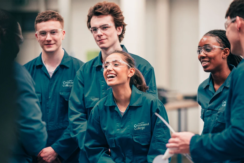
The refreshed Coastland brand has successfully repositioned the organisation as a forward-looking hub, one that reflects community pride while being agile enough to support growth into new sectors.
The result is an identity that feels timeless yet dynamic—anchored in Coastland’s values, while flexible enough to fuel its ambitions for the future.
Following the rebrand, Silverback continues to work as Coastland’s Creative Partner, supporting both strategic and creative delivery.