It was great working with the team at smiles+smiles from the outset, to establish a brand strategy/VMV, which then guided us when it came to creating the identity. We created a sleek modern brand for this B2C brand and established a style that reflected the joy people had when viewing their new smile. I really look forward to seeing the brand rollout and clinics start popping up on high streets across the UK.
Nick Thomas
Head of Design
Discover
Following a routine dentist appointment and becoming aware of the dental procedure, Composite Bonding, Smiles and Smiles was acquired by investment company Freston Ventures in 2024. “Composite Bonding?” you might ask. Say “hello” to the innovative and alternative method for individuals to transform their teeth and smiles in a pain-free, non-invasive, and affordable way.
Having successfully worked with Freston Ventures on multiple projects over the years, Silverback® was the ideal choice as a Creative Partner. Tasked with a full-scale rebranding project with multiple deliverables, the ambition was to enable the Smiles and Smiles brand to expand nationally.
Through thorough research and collaboration with the client, we helped define a clear and navigable brand strategy and customer value proposition.
Design
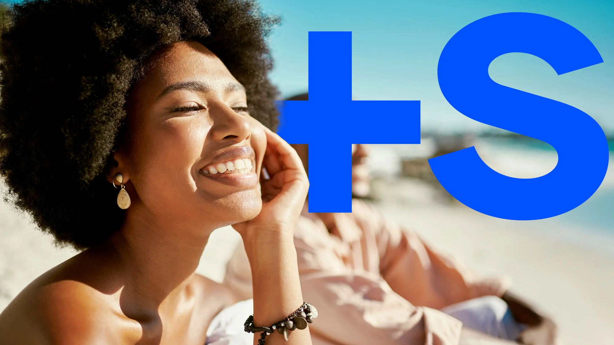
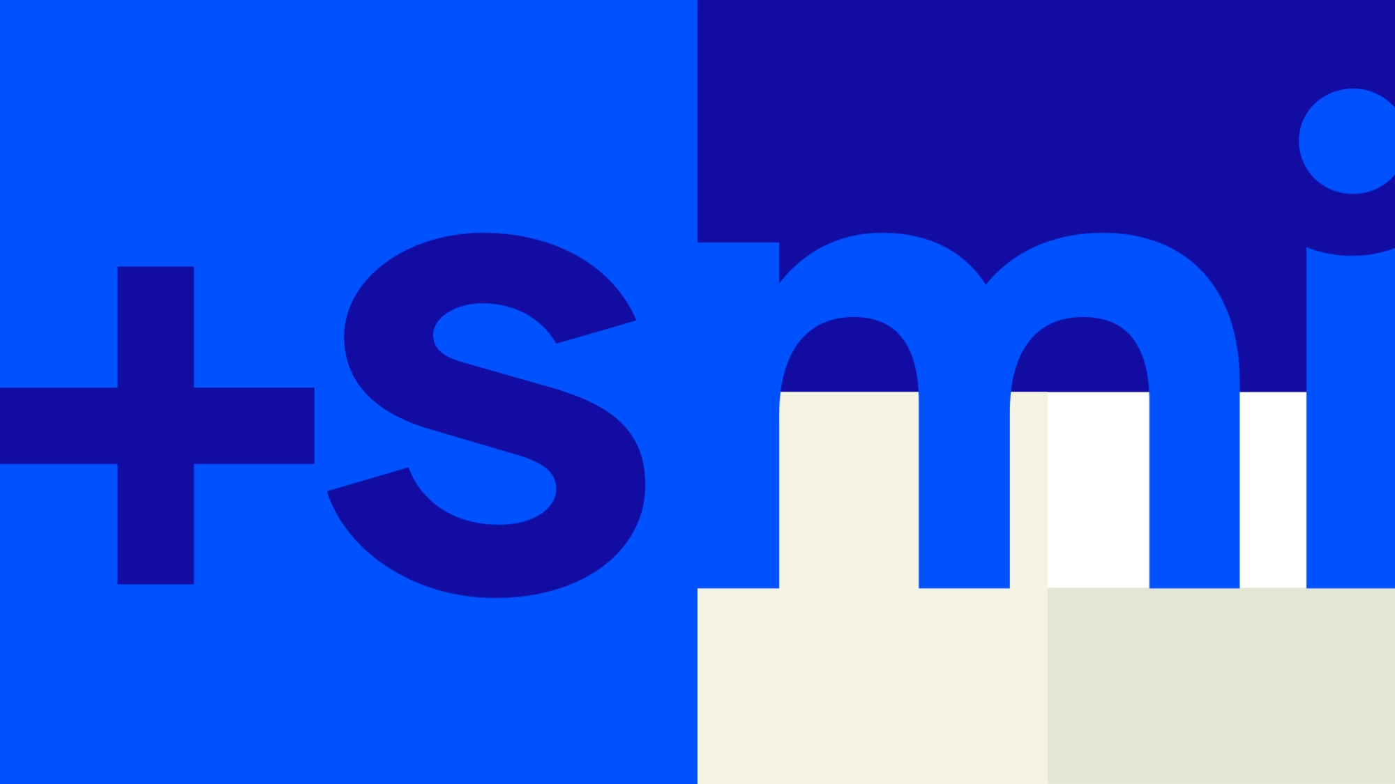
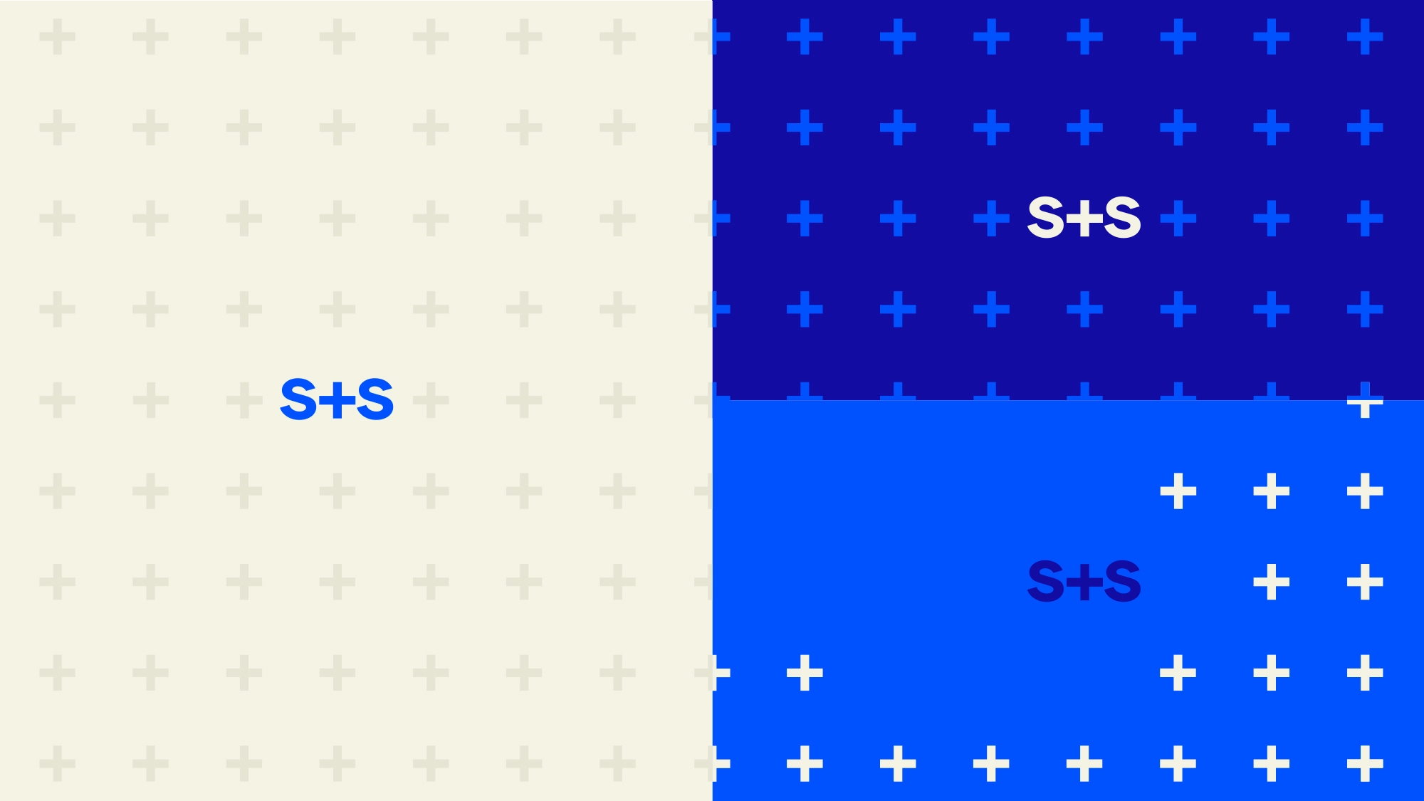
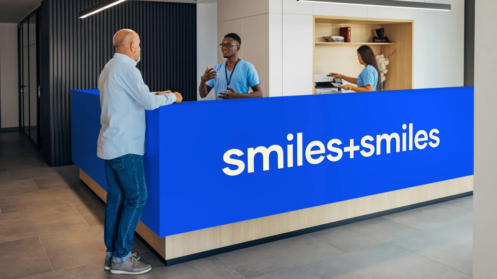
Like the customer smiles that Smiles and Smiles have become known for, we created a curved design tool that could be used as an accent throughout their digital and printed marketing materials. This curve has also been incorporated into the typographic logo on the letters ‘i’ to provide additional character to the bold font used.
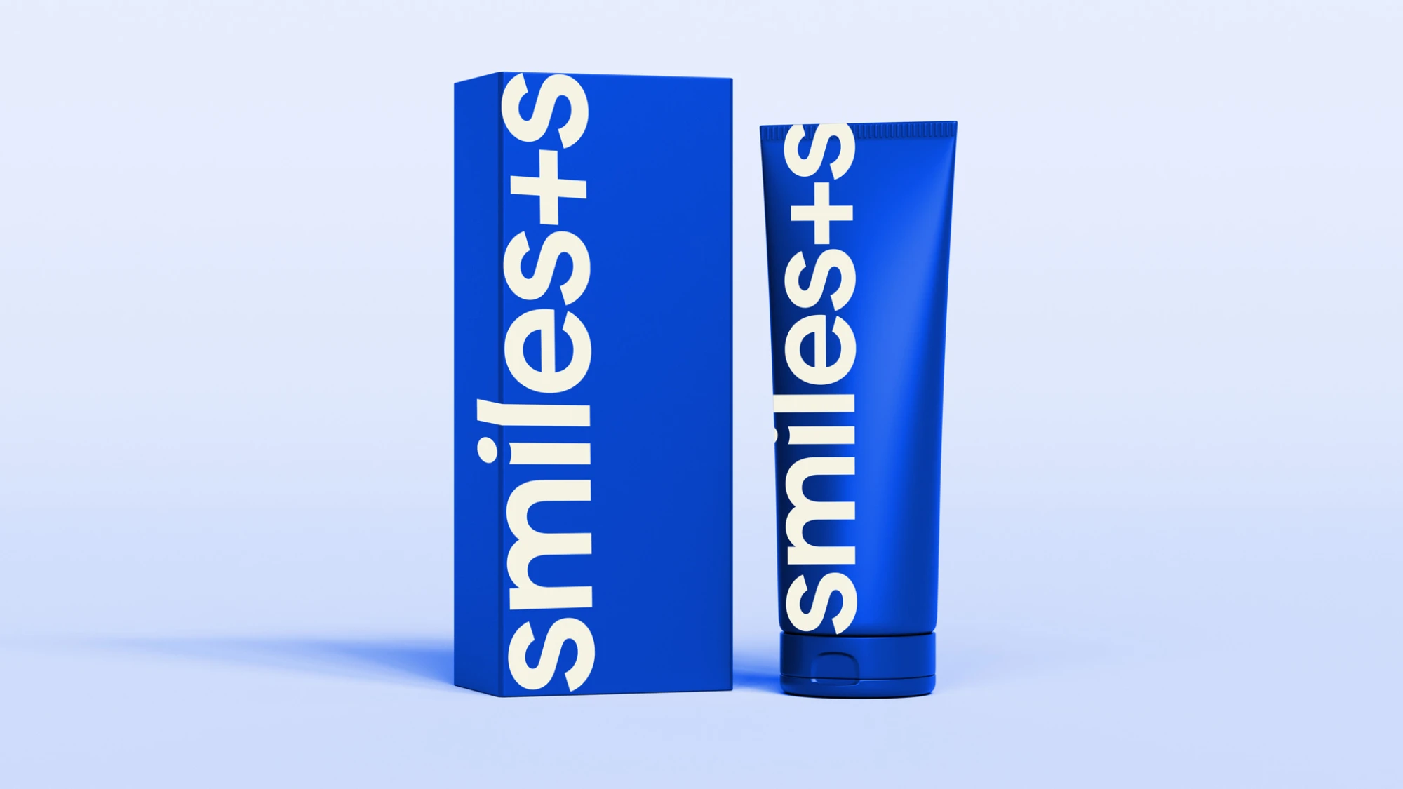
Royal blue and white have been chosen as a primary colour palette, providing potential patients with a calm and confident way to wellbeing.
Develop
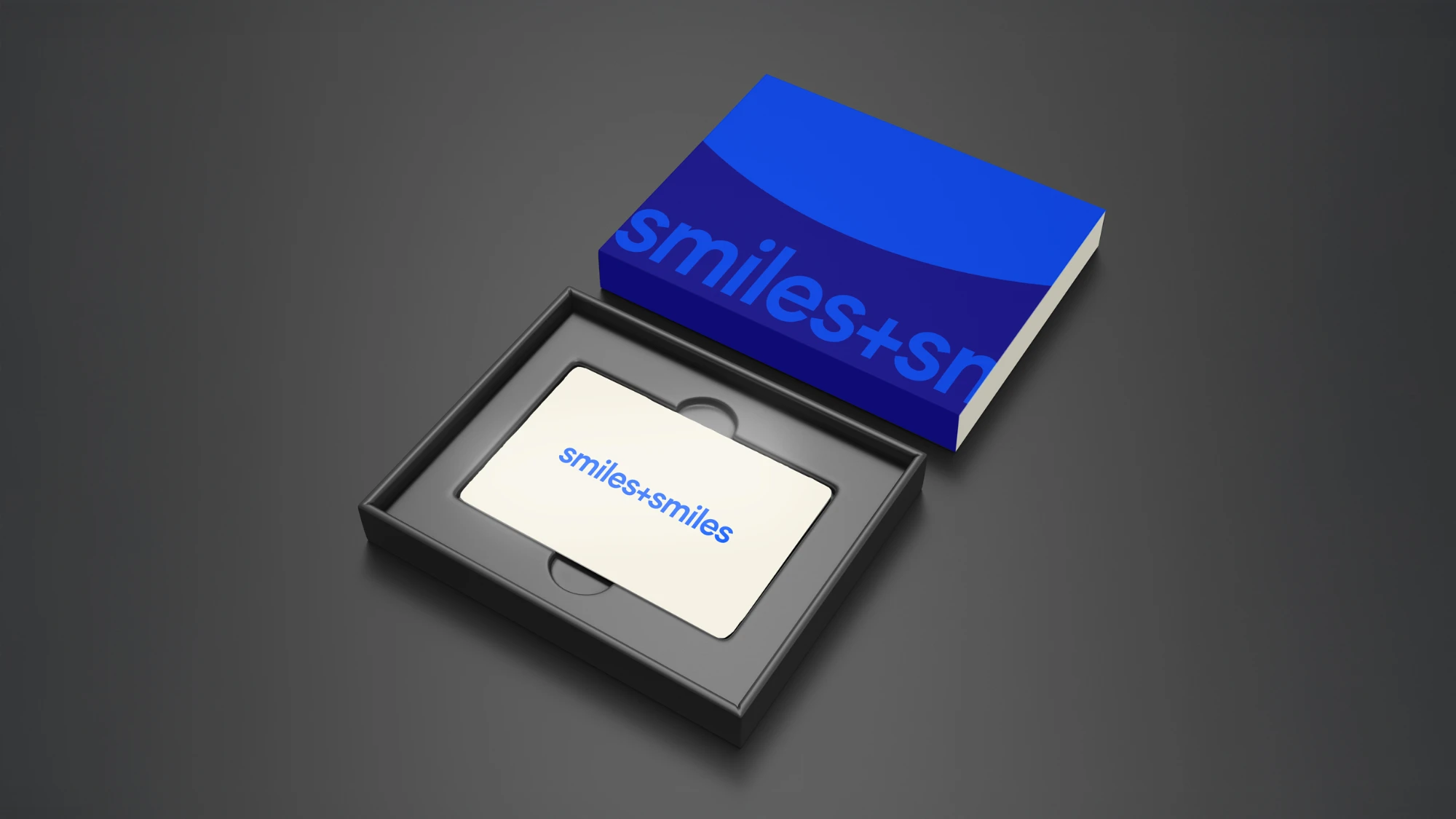
To create a brand and logo that could be used across multiple placements and settings, we wanted to provide a shortened version that was unmistakably Smiles and Smiles. Incorporating a ‘+’ symbol allows for an abbreviated version to be used when usable design space is limited; Welcome to the Troop, ‘smiles+smiles’ or ‘s+s’ for short.
Deliver
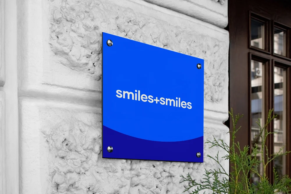
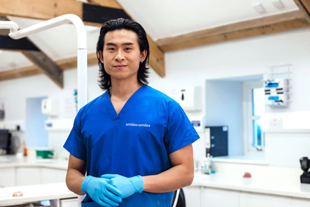
As requested, Silverback® delivered a rebrand that allowed for smiles all round. A clinically clean logo and clear brand guidelines, complete with fonts and colours, have enabled the smiles+smiles team to create brand-consistent comms and a new website.
The Troop continue to work with smiles+smiles on their brand strategy and development.