I immediately felt that Silverback knew what we were about and what we were trying to achieve. I was new to the company and I think Silverback has accompanied us on a journey… it’s been like having an extension to the team really, who understand what you are about, come up with ideas and work with you on what you are trying to achieve. It’s been important to our success that it’s been a partnership. That cultural fit has been really important.
Sue McKinney
Marketing Manager, Chandlers Building Supplies
Discover
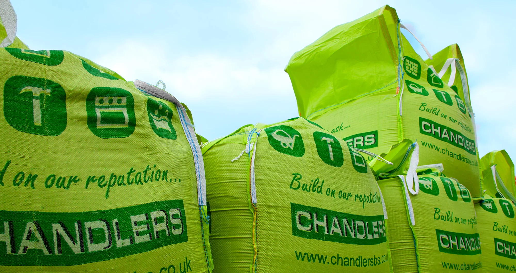
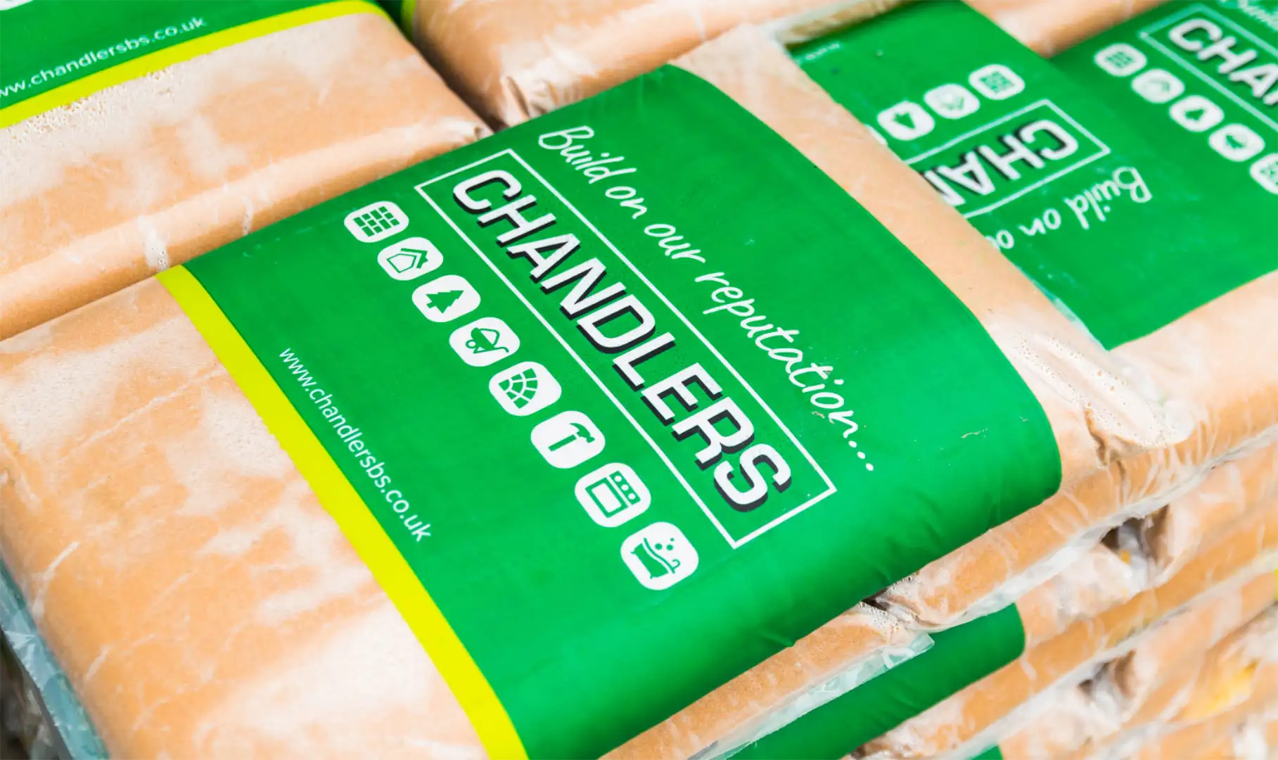
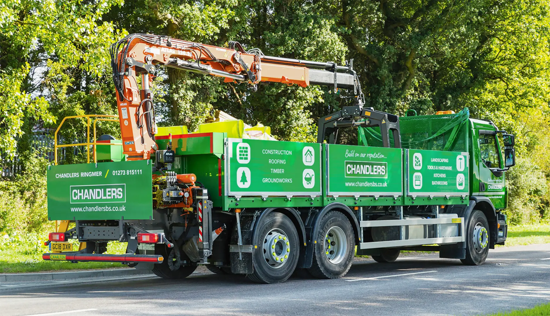
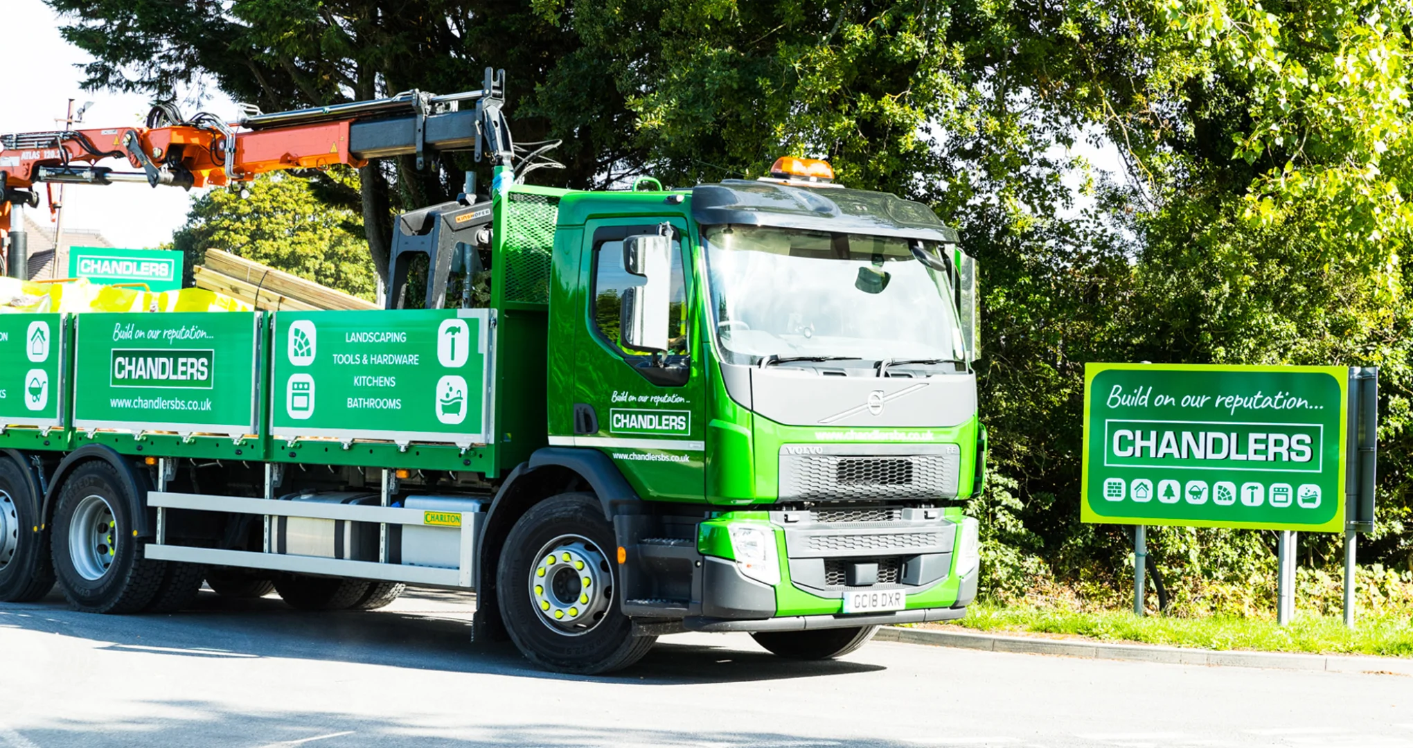
Chandlers is a long-established, privately owned builders merchant based in the South of England. They originally came to us for a brand refresh; they were keen to get across the friendly, family feel of the company and create clear messaging, whilst promoting the specialist areas within the business.
Design
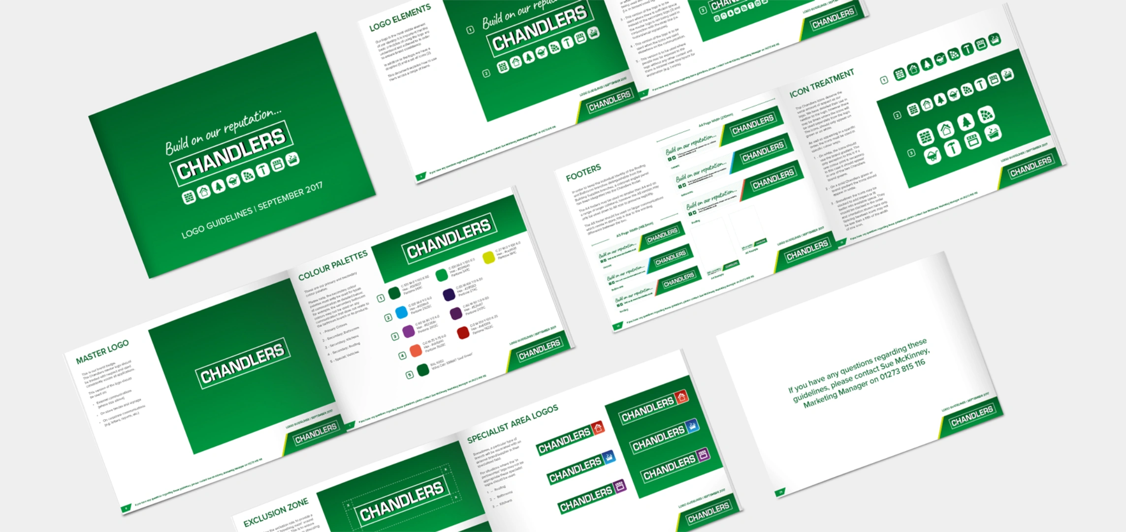
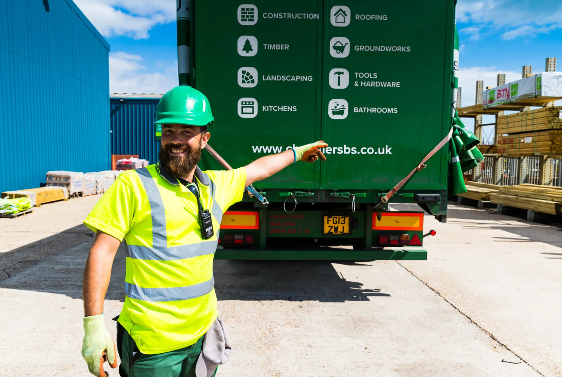
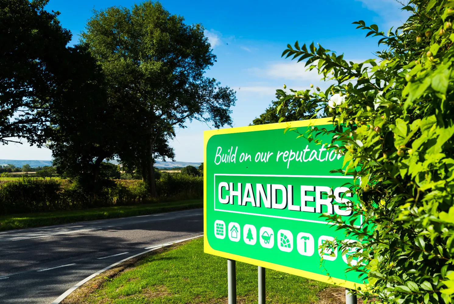
Through workshops with their people and a detailed brand audit, we quickly realised that the brand was inconsistent, with various versions of the logo and no common way of presenting the brand. Together, we created a consistent way of displaying the brand, a distinct look & feel for their promotional items and a set of icons for their range of services as well as icons for each specialist area. This was all documented in clear and concise brand guidelines, which explained clearly how to use the logo, strap-line, colour palette, fonts, tone of voice and imagery.
Beyond the main brand piece, we have also designed fun, interactive promotional pieces, as well as a 12 month advertising campaign, way-finding and signage for their stores.
Develop
We created a consistent look & feel for the Chandlers brand that creates impact, is easy to use day-to-day and most importantly, reflects their company culture. The relationship doesn’t end there; as their creative partner, we have worked on numerous projects together – helping and guiding them to strengthen the brand through powerful, intelligent design.
Sue McKinney
Marketing Manager, Chandlers Building Supplies
Deliver
We have loved working with Chandlers and are proud of the deliverables we have produced for them and seeing the positive impact this has had on the business. All deliverables that were rolled out created a seamless brand identity – whilst the brand guidelines ensure consistency throughout and avoid future misuse. We look forward to seeing what the future holds for Chandlers!