We initially contacted Silverback to rebrand our Merchant Taylors’ Foundation, we were so pleased with the results and now approaching 700 years as one of the ‘Great 12’ livery companies, we tasked them with refreshing the Merchant Taylors’ brand. A new updated crest for the modern age and full brand guidelines were created, which not only retained the heritage but gave clear direction for the future. Thank you to the Troop!
Sam Cozens
Information Manager
Discover
The Merchant Taylors’ Company is one of the ‘Great 12′ Livery Companies of the City of London, formed in 1327 as the regulator and trade body of tailoring and its related industries within medieval London. Over time it has become a grant-making organisation whose members are driven to channel their collective good into volunteering, raising funds, or offering their time to support causes that can create transformative good to many lives. Merchant Taylors’ creates lasting transformative change. We were approached to update the brand and bring it all together with a set of brand guidelines.
Design
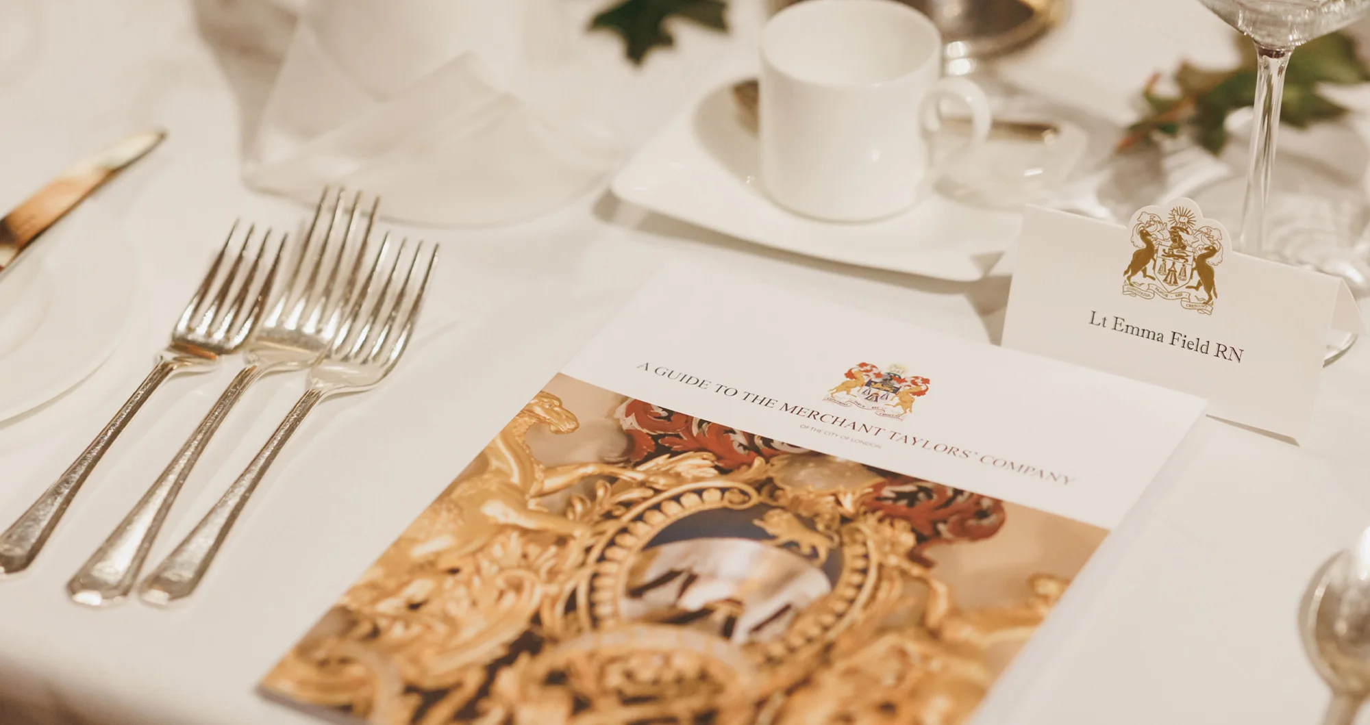
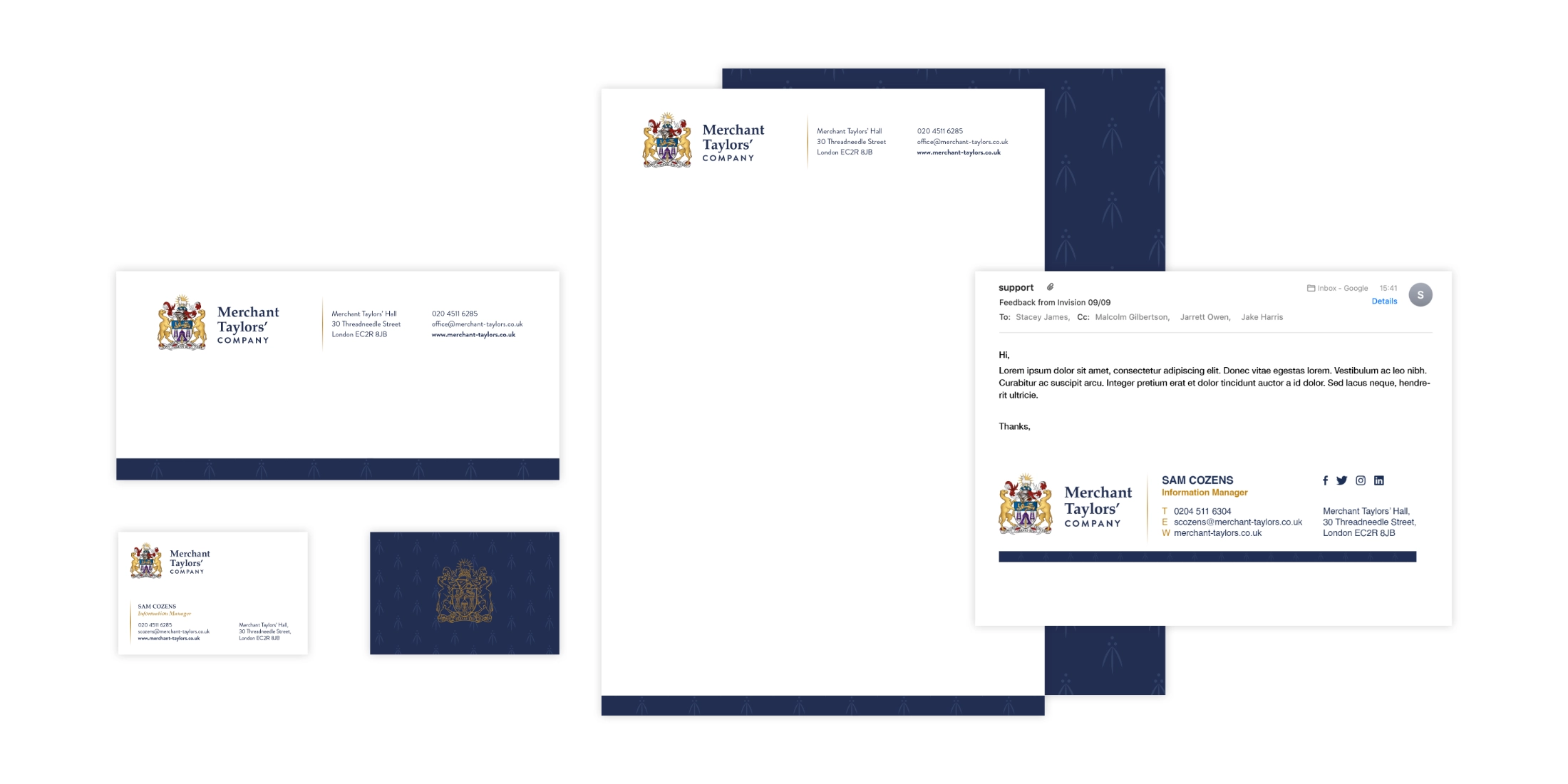
After a review of the Merchant Taylor’s Company we set about creating a new vector ‘Full Achievement’ crest with a modern feel whilst retaining the tradition and heritage. This was then applied to the core touch points of stationery, email signatures and the website.
With nearly 700 years of heritage, the design needed to be sympathetic to the history, whilst setting a standard that would act as a foundation for years to come and allowing the livery company to prosper.
Develop
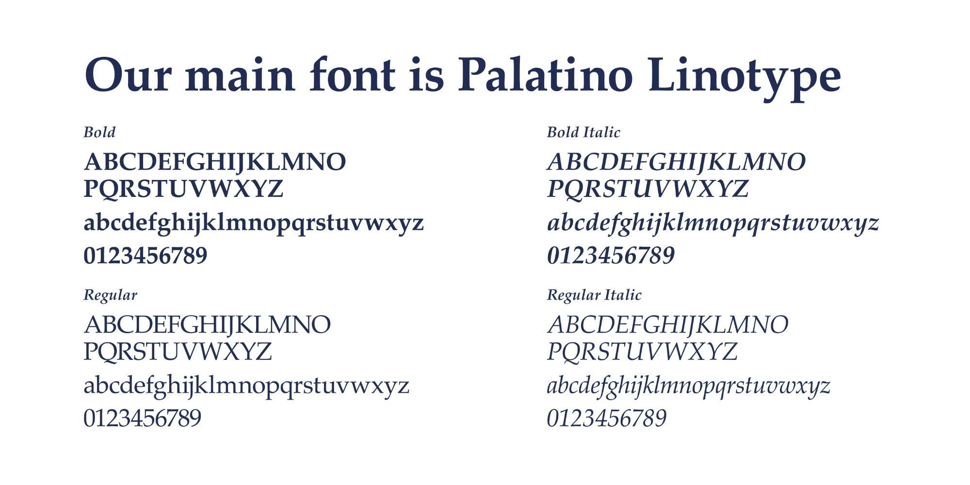
Taking the newly designed ‘Full Achievement’ as the starting point we reviewed the brand and created a full set of guidelines, that included everything from fonts and typography, to photography, tone of voice and logo usage.
The guidelines also included sections on the newly created ‘The Merchant Taylors’ Foundation’ logo and usage and the brand in action, showing templates for multiple items including stationery and email signatures.

Deliver
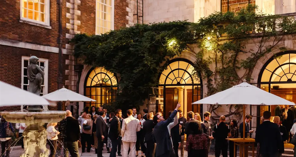
The revised ‘Full Achievement’ has been well received within Merchant Taylors’ circles and has now been rolled out across all touch points. This is the second livery company Silverback® have worked with giving them a refreshed look and feel whilst retaining nearly 700 years of heritage. Proud of the work we’ve completed with The Merchant Taylors’ Company we look forward to a long and fruitful partnership.
If you’re a livery company or looking for help revitalising your brand identity, get in touch and see how we could help!